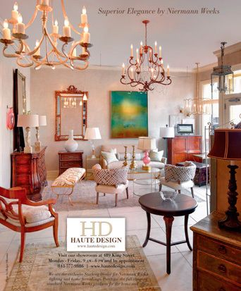
This ad was photographed by Holger Obenaus and featured a new line of furniture they were offering.
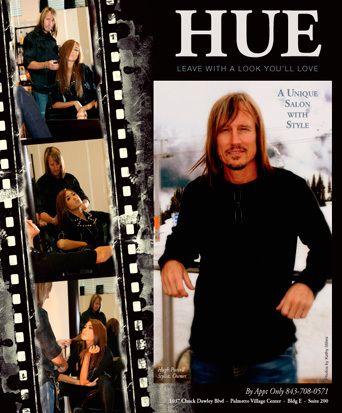
Hugh Purcell, local Charleston hair stylist, opened his own shop. His eclectic style and unique approach gave us the fuel we needed to do something unique for him.
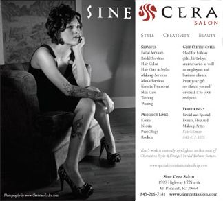
This was fun because, at the time, I didn't deal much with fashion or salons. That has since changed, but the photography on this ad was really nice. And the black and white aspect made it especially interesting.

Ledford's needed a way, quite frankly, to fit their ad and business into Charleston Style & Design magazine (normally filled with architects, interior designers, galleries, etc). We sought out a campaign that could mesh happy home life with a pest-free life. This was the spring-summer ad!

In Ledford's fall-winter ad, we continued the campaign to mesh happy home life with a pest-free life. Who can go wrong with a mixture of kids and pets!
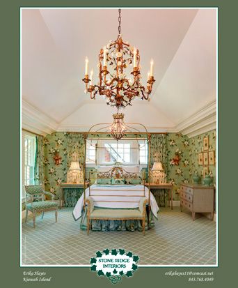
Erika Hayes has a very unique style. She can mix and match fabric and color and turn it into something beautiful. She needed an ad design that helped her energetic designs stand apart. This is the basic design we did for her. It varies with each image, but the general look stays the same.
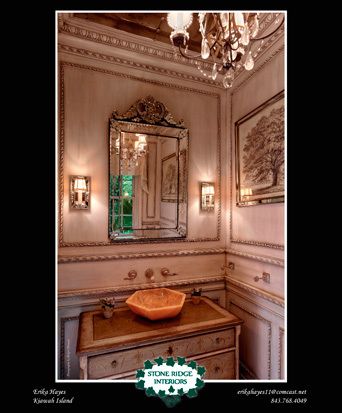
This is the 4th in her series of interiors. This photo contained such a unique shot of all the bits of detail in this room. We couldn't quite fit the amazing ceiling in, but again, Erika has taken a small space and made something amazing with it. Holger Obenaus photographed her rooms.
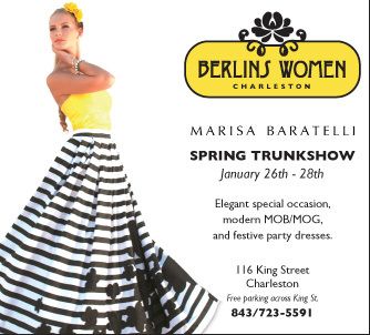
Everything with this ad just fit together, from the image to the logo. It's nice to be able to do an eye-catching ad that has good, strong, graphic elements to it.
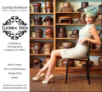
Lucinda Robinson is the designer at Lucinda Eden. They had several bold images, this one stood out the best. The focus is always on the fashion!

We get a new, energized photo each issue. In keeping with the same design, the image may swap left or right, color increases or decreases, and they seem to be growing in the classes they offer!
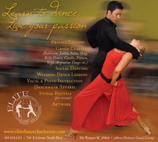
Elite Dance International Studio and Apparel is located in Charleston. Needless to say, they were a first in their category for Charleston Style & Design. We came up with a general design, colorful, energetic, fun.
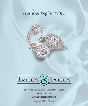
Embler's Jewelers has some exquisite pieces. Here we took a threesome and used a shot of material to get the effect. Of course, the material was a completely different color, but with saturation and other tricks of the trade, we found a color that worked well with the rings and allowed them to stand out properly.

This is a fun company with some great products for a pampered pet. Their color scheme and photography made this ad pretty easy to design. It's nice when the elements really come together to fit like a puzzle.
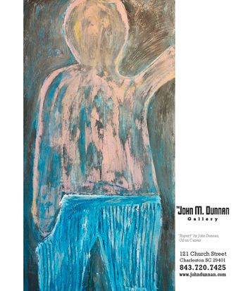
This was a great departure for us. We don't get a lot of folk art advertisers. We did several varations and this was the one they went with. It really stood out in the issue!
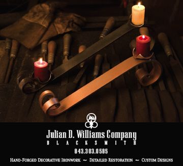
Julian Williams is a fascinating blacksmith in Charleston. His work stretches from candlesticks and clocks to intricate iron gate work and iron refurbishing. We did two ads for him. He actually used the candlesticks for the Winter issue. These beautiful photos were shot by Dickson Dunlap.
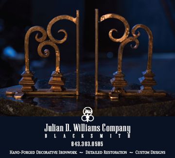
This ad forJulian Williams has not been used yet. Hopefully it will be in a later issue.
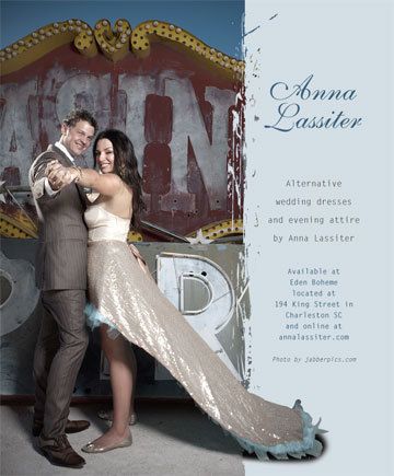
After introducing fashion into Charleston Style & Deisgn, we began doing several ads for designers. Anna's dresses are very hip and edgy, yet they are still for very formal occasions. We portrayed her in the grunge/edgy style she designs into her clothing, while still giving her a classy feminine look to the ad.
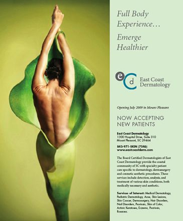
This was a first-time advertiser who had not opened yet, had not produced anything more than their logo at the time. We came up with the tagline for them and located the image to work with it.
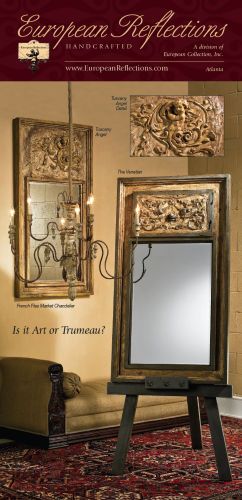
This company takes decorative pieces from other furniture, mantels, etc, and creates an entirely new mirror with it. They were introducing this line in Veranda. They recieved a stack of calls and orders from subscriptions, before the first issue hit the stands
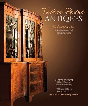
This is the third in a series of strong ads featuring special items from Tucker Payne Antiques. The amazing photo is by Dickson Dunlap.
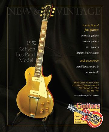
Shem Creek Music covers a wide variety of instruments, including high-end Gibsons. They wanted a classy look to their ad to show off the gold Gibson.
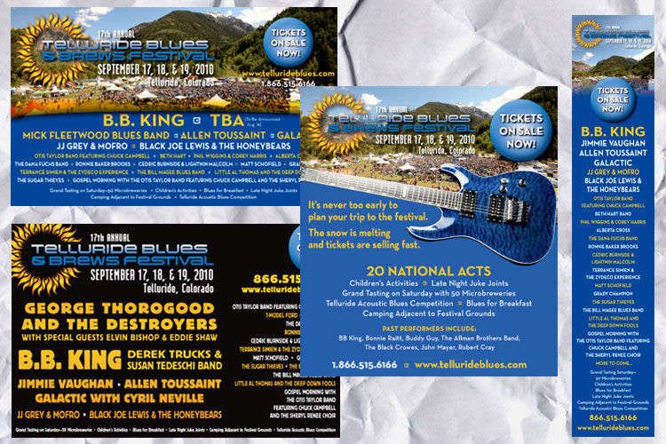
We began with the blue guitar image. As the list of performers grew, we made changes to accommodate. The black ad was the very last ad of a series of nearly 30 ads.
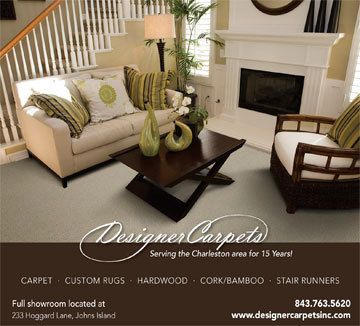
This ad was designed for a client offering high-end carpet. We wanted a photo and carpet that was livable and classic and beautiful. The ad is working for the client.
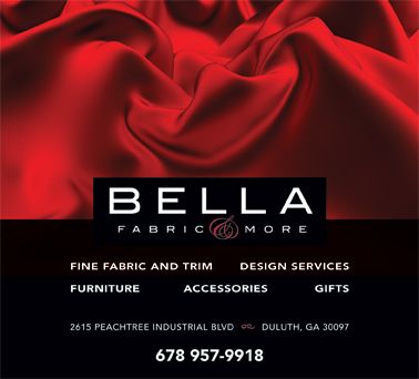
This was a one-time advertiser in Atlanta Style & Design. We wanted something that said classy and also pulled in some nice winter/holiday colors for this brand new fabric center.
