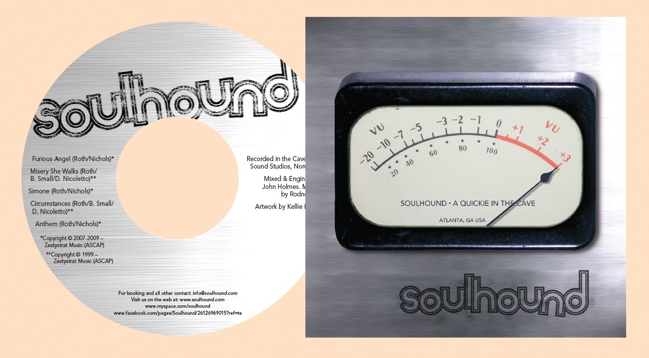
This local funk/rock band approached me to take a partially designed piece and finish it up for them. As CDs go, it's a slow process, between working with the band to come to an agreement on design, all the way to waiting on copyrights and various legal issues to be finalized. The result was their first CD to sell at shows.
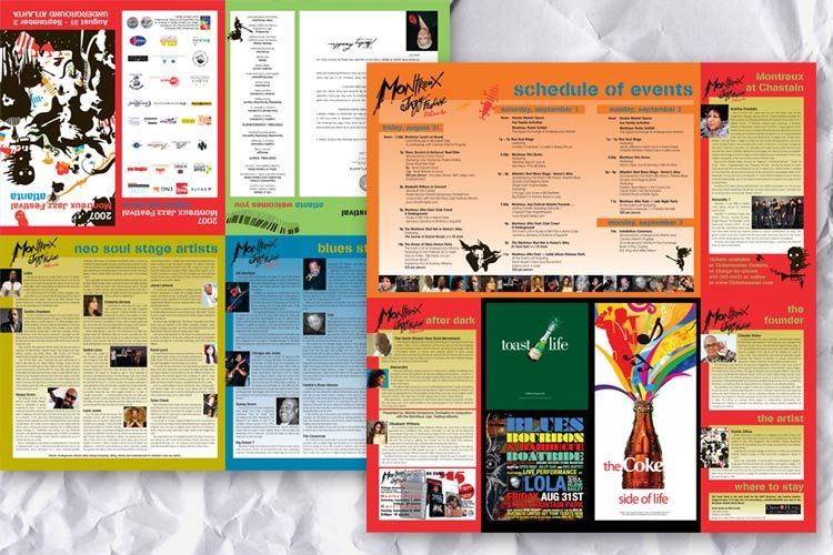
This was a piece similar to a map. It folded up into 1/8 this size. It was jammed full of info, much of it changing at the last minute. The people seemed to enjoy the piece. They read it, used it to block the sun, sat on it, then picked it up and read it some more!
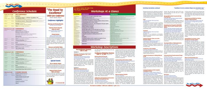
This was an oversized piece, produced in a tight turn with a local printer. It was the one conference piece other than their actual workbook. Make sure you choose an excellent printer when attempting an odd size on a tight turn.
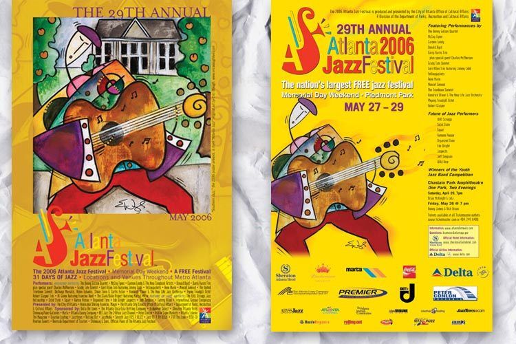
These are two different posters for the Atlanta Jazz Festival. The left one was one of 4 posters over 4 years using the 4 parts of the original painting. The second poster was more informational and changed several times as artists were added.
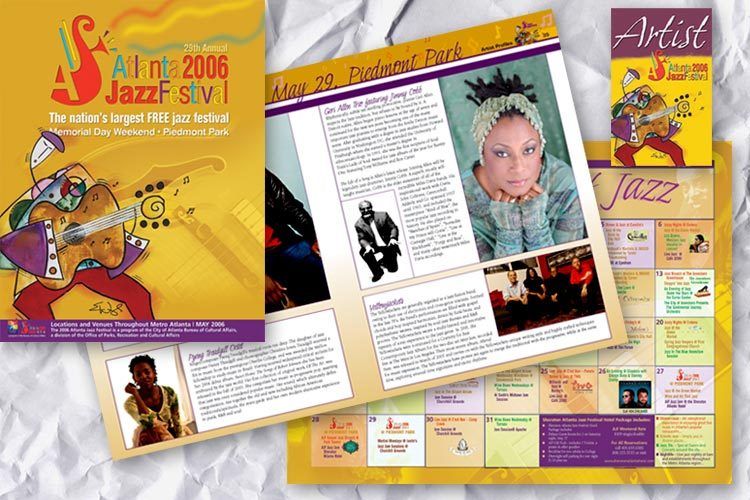
These are the cover and some pages from the Atlanta Jazz Festival program book. It was a magazine that covered the entire festival. The badges were designed for each team category of volunteers.
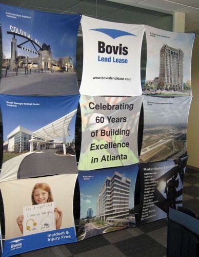
Bovis Lend Lease needed a new trade show display. They have a standard design they work with so it was a matter of gathering the right images and then working the piece through their corporate offices. They were pleased with the outcome.

Tex Mex Experience (TMX) is a band formed under Shawn Sahm, son of Doug Sahm. This band is a very lively mixture of Texas rock/country and Mexican-influenced Spanish sound. We tried to capture movement in the design — these guys never stop moving once they hit the stage.
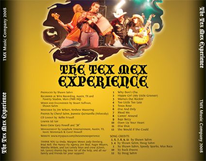
This is the back of the tray card. We tried to keep the movement flowing keep the classic Spanish look to the band's name, and at the same time give a feeling of the heat TMX puts out while performing.

This is the inside of the tray card, the part you see when you open the package and remove the CD. Again, we surrounded the words with images of the band to match their lively personality that makes their music unique.
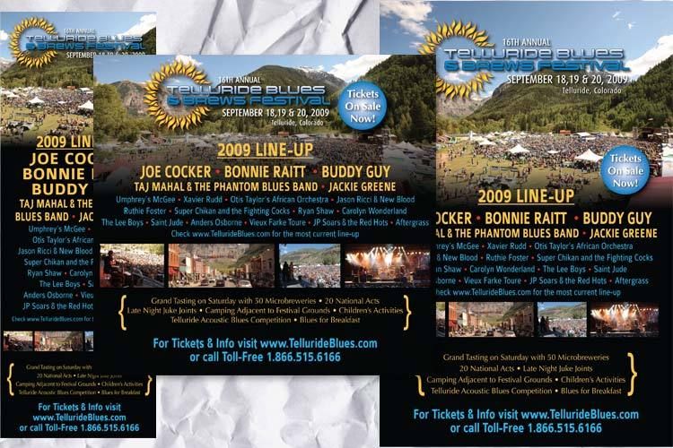
I was called in to take a current ad design and rework it to fit all the different ad placements that had been ordered. This was more of a production job, but I did have to redraw the logo in Illustrator and then work on tight turns to get the ads out on time.
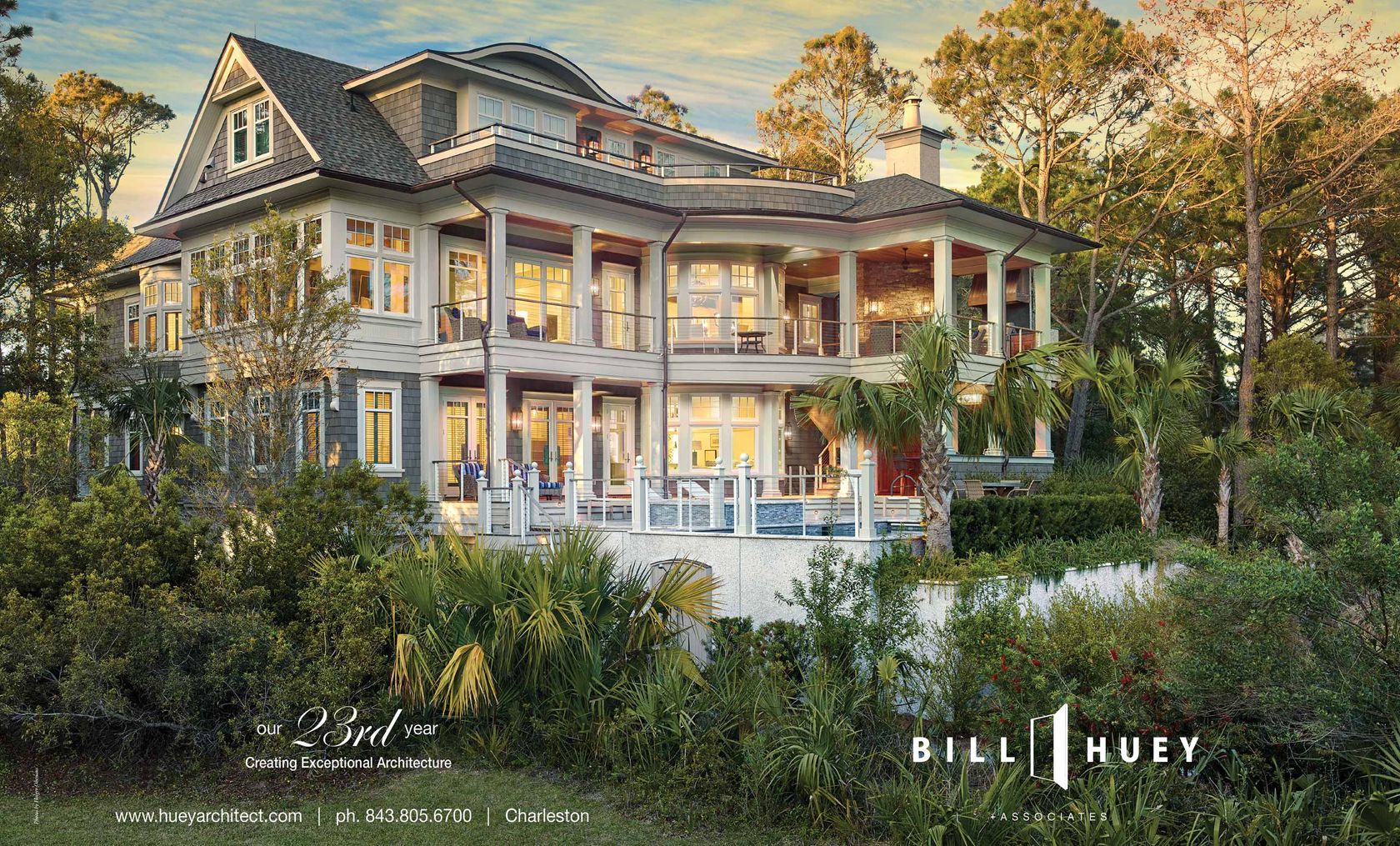
Ad spread for Bill Huey Architect in Charleston Style & Design magazine.
